Focha
01.08.2021
Place
gdyniaPartners
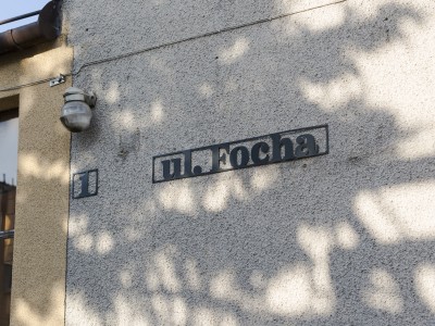
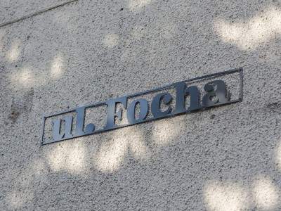
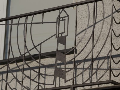
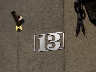
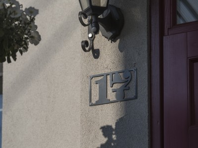
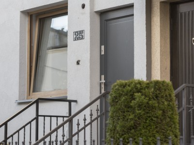
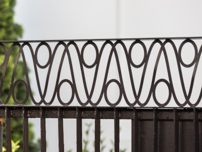
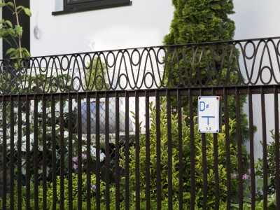
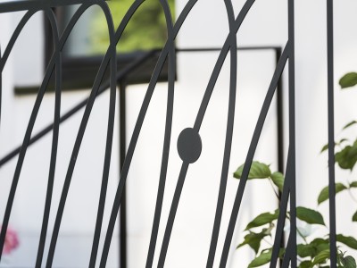
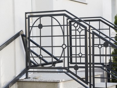
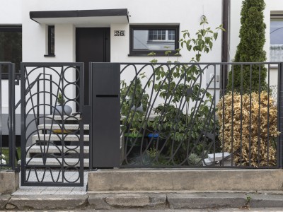
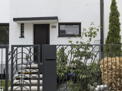
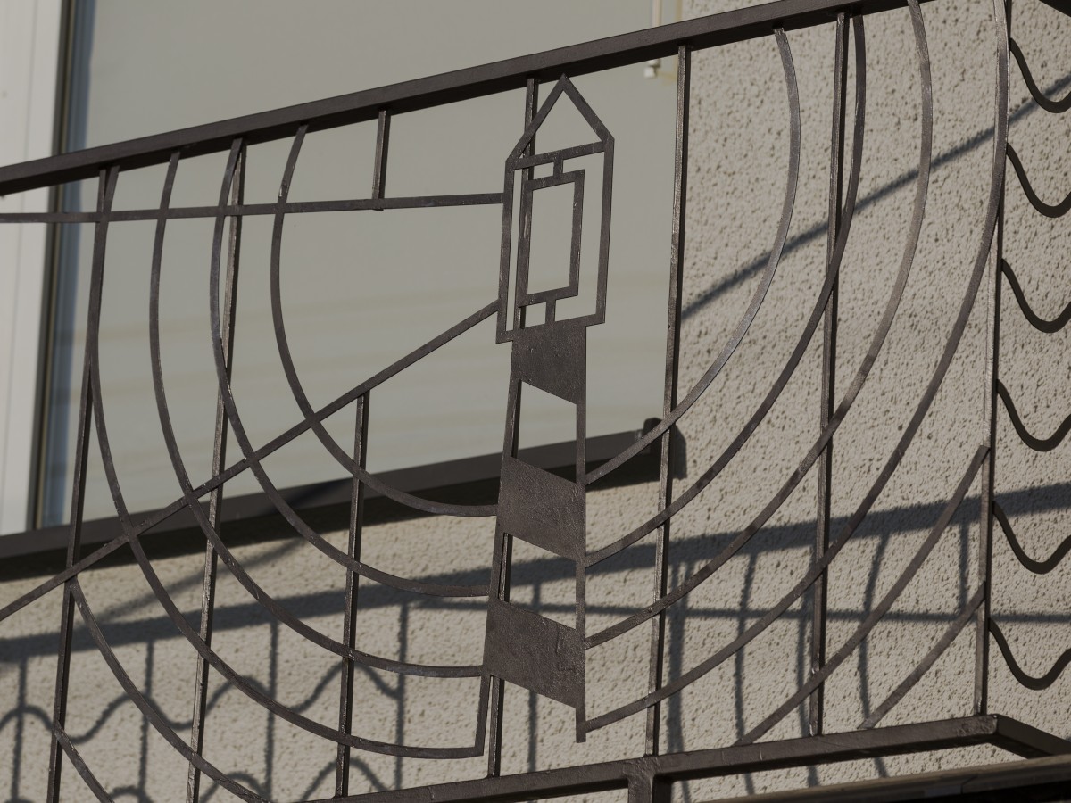
Miasto Gdynia, Mapalu, Flugger FarbyThe project consists of an array of design interventions aiming to unify one, characteristic street’s appearance. Closely working with the residents, Traffic Design’s team has created new facade colour designs and ornamental metalwork, such as fences and house numbers.
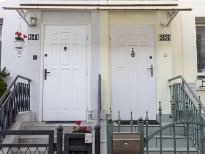
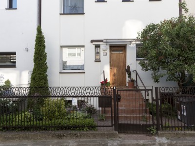
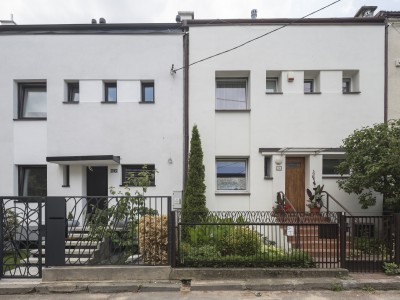
We have chosen Focha because of its origin story, distinctive architecture and character. This is where the architects and urbanists planning the district had lived. Terraced houses line up on both sides of this narrow lane, creating a unique atmosphere in the heart of Wzgórze. The main characteristics are front yards full of greenery, the rhythm of architecture and the variety of details.
Since the mid-war period houses on Focha Lane have been redecorated many times. Past and present residents added their own fences, house numbers, entry roofs, lamps, stucco work, window joinery and even whole new windows. The mingle-mangle of architectural detail, colour and metalwork resulted in a chaotic bit of cityscape. Traffic Design Studio’s aim was to create a visual line for the street, to introduce some coherence, but not to cast away every resident’s individuality. We set out to create an aesthetic that could be translated into different media, totalling in a mosaic of congeneric shapes. We were looking for visual identity that would not be based solely on unification.
